
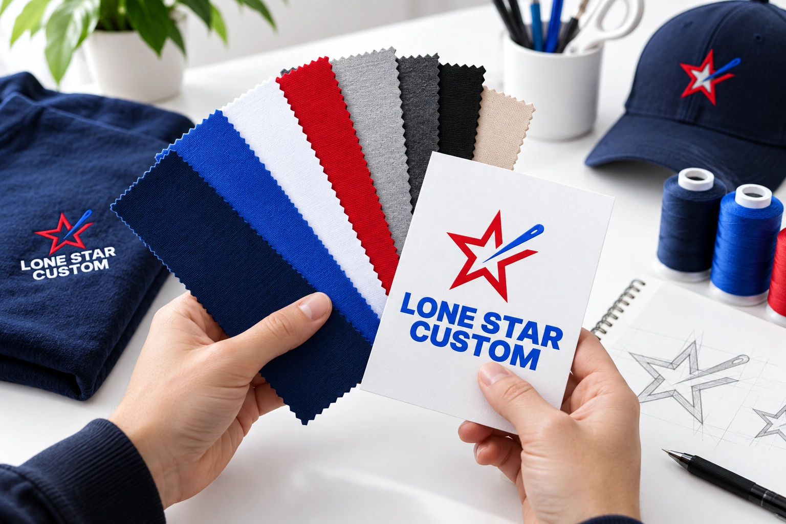
Earth tones can create a softer, more understated merch system
Olive, sage, sand, cream, rust, brown and dusty blue can give custom apparel a grounded look when the colors fit the brand. The strongest result comes from planning the garment, artwork and decoration together rather than choosing a trendy blank in isolation.
Start with the brand, not the trend
Review existing logo colors, photography, packaging and environments where the merchandise will be worn. Earth tones can work well for lifestyle, hospitality, wellness, outdoor and corporate programs, but they are not automatically right for every identity.
Build a controlled palette
Instead of adding many similar neutrals, choose a small group that works together. A practical assortment might use one light neutral, one mid-tone color and one darker anchor color so products feel coordinated without looking identical.
Protect logo readability
Muted garments still need enough contrast for the logo to read. Tonal printing or embroidery can look refined, but very low contrast may reduce visibility. Review proofs at realistic size before production.
Match decoration to the product
Embroidery, screen printing and digital transfer methods produce different textures and levels of detail. A tonal embroidered logo on a hat creates a different effect from a large printed graphic on a garment-dyed tee. Choose by product and artwork.
Do not confuse color with sustainability
Earth-inspired colors may look natural, but color alone does not establish an environmental benefit. If sustainability matters to the program, evaluate the actual material, sourcing, certifications, production and expected useful life of the product.
Plan the assortment for reorders
Document approved garment colors, logo treatments and decoration specifications so later reorders remain consistent even when the program expands.
Explore Promotional Products · Explore Services · Plan Your Merch
Preparing logo files? Adobe’s raster and vector guide explains how image formats behave when resized.
Continue planning
How to Build a Smart Custom Apparel Program · Gear Up for Game Day: Custom Shirts for Houston Tailgates